Mark Bloom talks about his career, the industry and his book
Many would-be designers leave University starry-eyed and full of get up and go, but a significant portion of them soon find themselves stacking shelves on the night shift at Aldi, bitterly and half-heartedly criticising the kerning on a can of own brand baked beans to a dishevelled and dead-eared herd of zombie shift workers, forced to trade their dignity and their diploma for an orange polyester shirt.
Mark Bloom is not one of those people, having spent the last 15 years working as a graphic designer, Mark Bloom has produced a phenomenal portfolio, bursting at the seams with projects of the highest standard.

Hi Mark Bloom, to begin with, could you tell us a little about yourself and how you became involved in the creative industry?
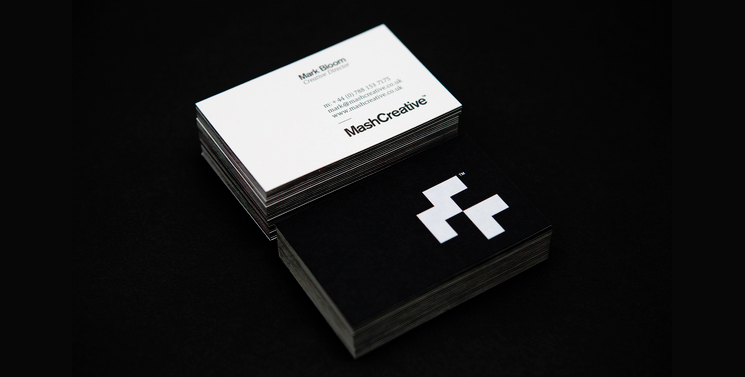
Sure. I’m Mark Bloom more commonly known as Mash Creative, a graphic designer based in East London. I have been a professional designer for over 15 years now and set up my design business in 2009.
From a very early age, I always loved art and knew even then that I wanted to get a job in the creative industry. After being awarded a book on Graphic Design during my school years for Art I was greatly interested in what Graphic Designers did. After work experience at the age of 15 within a graphic design studio it was clear what I wanted to do – become a designer!
After receiving my A-levels in Art & Design, I then went on to take a one-year foundation in art followed by a three year degree in Visual Communication Design at Middlesex University, London. I was very fortunate to land my first design job just two weeks after graduating from Uni and have been working as a graphic designer ever since then.

What pushed you to start your own business, Mash Creative?
I was made redundant from a job and decided that after working for other people for more than a decade rather than go into another job I would set up my own graphic design business.
Having worked in small businesses for most of my working life, the experience and knowledge I had gained during that time certainly came in useful, although setting up a design business in the middle of a recession has been far from easy.

You first book, showcasing 41 logos that you designed, is very minimalist however your next book which highlights 115 of your designs uses a different approach, so could you shed give some insight into the motivation and strategy behind the new book?
14/41 book was a response to a project I had published on Behance titled 14 Years, 41 Logos, essentially a showcase of my favourite logos I designed during my 14-year career. The project was featured on the Behance front page and had a great response; many people actually asked if I would make it into a book – so that’s exactly what I did. I wanted to show the logos in their most basic state, this being black and white as I have a saying “If it works in black and white it should work in any colour”.

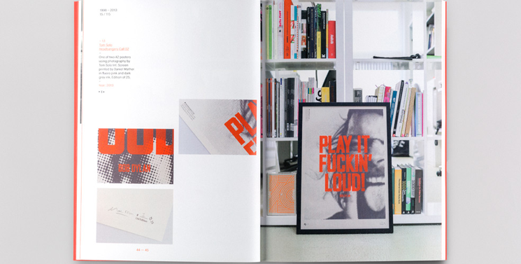
15/115 has evolved from my previous book but still nods to the design of 14/41 in that it also showcases the logos in black and white, albeit nearly double the amount this time (80 to be exact). In addition to the logos, I have also included x 15 posters and x 20 Case Studies. As with 14/41, 15/115 showcases 115 projects from my 15-year career. With my new book I wanted to do something bigger and better, both in terms of design and print, which is why the book features some special print finishing including a thread seen spine, white foiled cover, fluorescent orange and more.

As to why I did it, I guess I just love a challenge and a challenge it has certainly been. I have had to arrange numerous photo shoots of my work, design the book, arrange for print, sponsorship, proofreading, handling orders – the list simply goes on and on and all between juggling client work!

In all honesty, I hadn’t anticipated the amount of time and money needed to handle a project of this size but am really happy with the way it has turned out and so far the feedback has been really great!
The 9th 366 Award goes to Mark Bloom for his outstanding creative work.

You designed a typeface (RM Regular). Has the font been popular and have you seen it crop up unexpectedly in a random design?
The font has been fairly popular, and I have received plenty of requests to introduce new weights, something I will certainly be looking into in future.
I have had designers email pictures or Instagram the font in use which is always nice to see. The whole font, including the glyph set, only took three days in total to design. As with 14/41, I only decided to make it available to buy after receiving lots of requests from people who had seen it used for a Royal Mail Rethink In was commissioned to design by ICON magazine. The ‘RM’ quite simply stands for ‘Royal Mail’.
Looking back on it now I can see things I would like to change or tweak so would like to introduce a ‘Pro’ version where I can tidy the font up.

Who / what are your greatest inspirations?
I draw a lot of my inspiration from Swiss modernist graphic design and love grid based typography. When designing identities, I try to follow a “less is more” style of approach.

Wim Crouwel is my ultimate design hero and was fortunate enough to attend Wim Crouwel – A Graphic Odyssey at the design Museum in 2011. I had always admired his work and was familiar with a lot of his poster designs so it was great to see them in the flesh. At the exhibition, I was simply blown away by how ahead of his time he was – a true pioneer. Even today, his work still looks current!
When I graduated from Uni in 1998, Designers Republic and Attik were a massive inspiration to me. Designers Republic weren’t simply tearing up the rule book, they were taking a chainsaw to it!

My children also inspire me – I want to produce work that they can look back on in years to come and hopefully be proud of their dad.
And finally, if you died and were reincarnated as a song, what would that song be?
Ha, Ha – that’s a bit morbid, isn’t it? Tough one, I really can’t think, I’d much rather be reincarnated as a dog – eat, sleep, walk and rest, sounds good to me!


