Creative Chair gets colourful and experimental with Maria Grønlund
This week Creative Chair is in Lystrup, Denmark where we’re talking to graphic designer Maria Grønlund.
Maria is known for pushing the limits of what can be done with Adobe Illustrator, as well as her liberal use of colour. You can see more from Maria Grønlund on Behance.

What inspired your passion for communicating with colour?
A colleague introduced me to Adobes’ site Kuler (now Color) back in 2009. In the beginning it felt a bit disappointing the color palettes only had 5 colors, but I soon realized how difficult it is to make a good color palette, juggling with five different colors.

This initiated a spark in me to pursue becoming really good at this. I seriously became obsessed with it, and for many years it was a daily routine to stop by Kuler/Color and make a couple of color palettes and get inspired by the other members of the community.
My colorful design has also been self-reinforcing, since it has gotten such a wide international and positive response. Of course, that makes me happy and feel inclined to make even more colorful design.

There’s a school of thought that says logos should be a single colour. What are your opinions on this notion?
I can’t see necessity of limiting logo design to be single colored only. It’s probably a school of thought that derives from the early days of printing. It seems a little bit antiquated compared to all the amazing opportunities printing techniques offer today.

Multi-colored logos are extremely popular, so why not add this aspect to your brand as well, if it suits your business? To make it even more appealing and eye-catching.
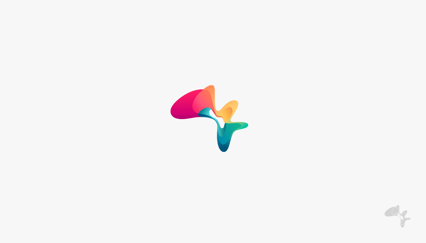
In general I think a single color logo version should be offered, when you design multi-colored logos (as a secondary logo version). But even here I think an exception is acceptable now and then, if it’s done cleverly and for the right client.


You experiment a lot with different techniques, particularly with Adobe Illustrator. Do your experiments ever find their way into a professional project?
Yes, they do surprisingly often! Well, you’ll never know when you’re starting out of course.

Last year I was commissioned to make an illustration for the exhibition “Our Lives in Data” at Science Museum in London. They requested an illustration in the same style as the “I speak fluid colors” series, but in vector only.
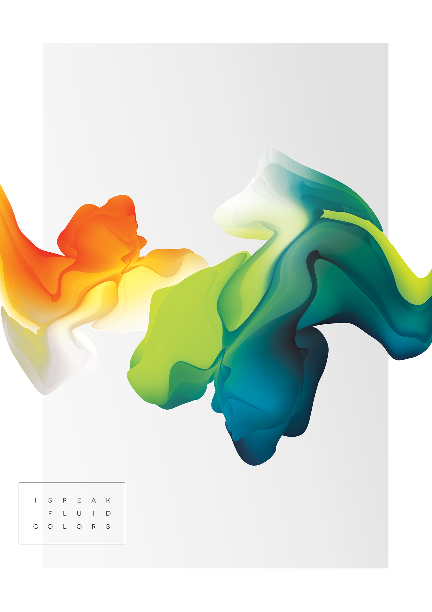
“I speak fluid colors” was made of vectors, but it was altered, rasterized and finished in Photoshop. So, it required some very challenging experiments to figure out how to make it in Illustrator only.
It’s extremely risky and demanding to make commissioned design that relies on experimental, untried techniques, that must succeed at any cost and at a deadline! Far from all experiments succeed…
I challenged myself and my computer to the uppermost limit on this experiment. But, we succeeded!

Normally, when my experiments are used for commissioned work, it is something I find in my digital drawer and refine to fit a specific project.
What has been your favourite experiment or personal project?
“I speak fluid colors” is my favorite personal project seen from a visual point of view. The project really did turn out very beautiful.
Seen from an experimental point of view, I think it must be my snow flowers. I remember when these beautiful, intricate shapes started to emerge on my artboard in Illustrator, from very simple shapes added layers of effects.
The 111th 366 Award goes to Maria Grønlund for her outstanding creative work.

It was one of those 4 am projects. Even though it was in the middle of the night and the rest of the family was sleeping I couldn’t help giggling and say aloud: “Maria, you’re a genius!” Of course, I don’t consider myself a genius, but the result was incredibly intriguing and it was clear the latent potential of this technique was mind-blowing. Illustrator never ceases to amaze me this way.
When I was a speaker at Adobe Max last year I walked the audience through the steps of how I’ve made the Cosmos flower. The flower is made with a technique similar to the snow flowers. My point was to demonstrate why exploratory playfulness surpasses math in a creative process like this.
The flower is made in very few steps, but the amount of potential outcomes you have by applying layers of effects to a simple Blend Object in Illustrator is breath-taking.
I calculated that by using this specific, very simple object, applied exactly the same effects and using exactly the same stacking order of the effects, you could get 1760 billion different outcomes! Simply by altering the values of the effects applied.
If it would take about 30 seconds to try each version (including Illustrator rendering the heavy result) plus 4 seconds per image to decide whether I wanted to use it or not, it would take approximately 6000,000 years to try all outcomes out.
It would be faster to traverse the entire Milky Way galaxy at the speed of light (which would be 100.000 years). It is incredibly fascinating that this is the space we’re navigating in, when we’re using Illustrator.
And finally, if you died and got reincarnated as a song, what would that song be?
“Can’t stop the feeling” by Justin Timberlake. It’s one of those songs I put on when I’m celebrating successful moments. A project approved or an exciting invitation landing in my inbox for example. Then I turn up the volume and make a happy dance.


