Interview with designer Lawrence Azerrad
This week Creative Chair is in Los Angeles, California talking with Grammy award-winning graphic designer, art director, and author Lawrence Azerrad.
While some designers ply their craft to all and sundry, Lawrence focuses on key industries that he has a passion for; namely music, culture, and education.
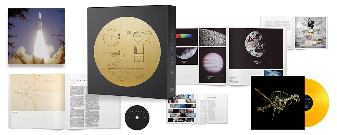
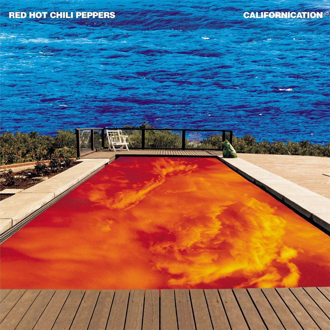
In addition to working with countless well-known musicians, Lawrence Azerrad created the now iconic album art for the 1999 Red Hot Chili Peppers album Californication. In 2017 he won the Grammy for his work on The Voyager Golden Record 40th Anniversary Edition.

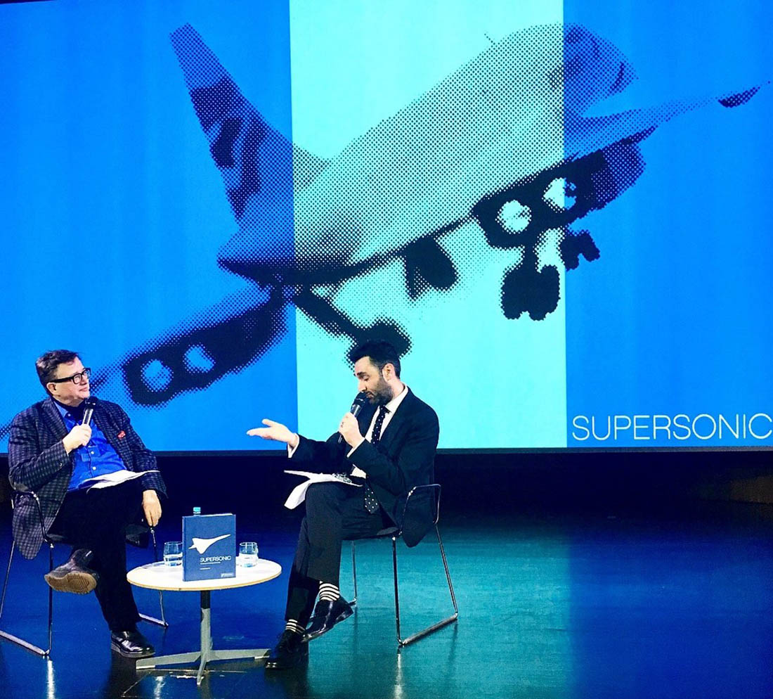
He’s had a lifelong interest in Concorde, which has contributed in no small part to the ethos he has as a designer. In 2018 he published a book ‘Supersonic: Design and Lifestyle of Concorde’ which is a visual exploration of the iconic aircraft and the design principals that brought it to fruition.
You can see more from Lawrence Azerrad on his website.

Unusually, most of your design work can be sorted into three categories – music, culture, and education. Why have you chosen to focus on these areas?
To us, it seemed quite natural to expand our focus to the areas of Culture and Education, as they both have a symbiotic relationship with music. All three disciplines are pillars of what enriches the human experience. Something we are very passionate about at LADdesign. It came less out of the necessity that designers faced after the changes to the music industry as a result of streaming technology…although that reality did have an impact on how we got to where we are today, and more out of wanting to broaden our impact as designers through meaningful work.

In addition to having a natural enthusiasm for all three categories, we found that they all relate to and benefit each other. Our process in our music work elevates the way we approach our branding for educational and cultural institutions and vice versa. Working in all three categories is really about listening, reflecting aspects of the human story, and inspiration.

Let’s talk about the Californication album cover. What were the circumstances that led to you being offered this project?
One of my first jobs out of school at the California College of the Arts was at Warner Bros. Records. It was a break in more ways than one as in the mid-1990s the label was an extremely exciting place to work as a designer. I had the chance to make art for and directly work with a bright list of artists I deeply admired as a 25-year-old kid, Elvis Costello, Wilco (whom we still work with) Brad Mehldau, and of course the Red Hot Chili Peppers. I worked quite closely with Anthony Kiedis, John Frusciante, and Flea. It was exciting, challenging, and a lot of fun.

What was the brief for the album cover, and what was your influence on the finished product?
The band wanted to explore a couple of directions simultaneously. The one that we now know as the cover was not the original one that we pursued. Once we got around to the swimming pool direction, Kedis had simply mentioned that guitarist John Frusciante had a dream, and in this dream, there was a pool where the water was in the sky, and the sky was in the water.
So we set out searching for the perfect swimming pool. This was pre-Google, so the hunt took a little labor.
Beyond that, it was a fairly open creative process. With the return of John Frusciante in the role of guitarist, and Rick Rubin producing, and listening to the music, there was a strong sense that with this album RHCP was a leaning into a big, rock sound.
In the design execution, it was my intention to reflect that epic-ness.. The brightness of the colors, including a special 5th color hit of PMS blue on the waves, the classic album type in the upper frame.

Your book ‘SUPERSONIC – The Design and Lifestyle of Concorde’ is the result of a long-term obsession with the iconic aircraft, but how did Concorde contribute to you becoming a designer?
Being a long term passion project that was fulfilled in the book being published and the speaking tour in support of the book, the project as contributed to me as a designer in a number of ways. Fundamentally, being passionate about a topic and seeing it through, to tell a story that you care about through design is something that I believe a lot of designers can connect to. Our work is mostly about communicating with others, hopefully enriching other people’s lives through design. If we can achieve that objective through a project that you care about, it is even more fulfilling. The book becomes an exercise in dedication, follow through and sharing. Knowing that you can achieve this goal…after many setbacks is something we can all draw on. This principle informs a good deal of my other work, to stay the course, remain committed, lean toward follow through, and through this persistence…you can do it.

From a more aspirational perspective…the book isn’t so much about the legendary aircraft as it is about the general principles of design that made it a reality. It’s about the larger idea of how design (as we see in Concorde) can work to unify, inspire, and motivate people. Its about what happens when ingenuity, creativity and determination come together. It’s about the human need to reach for progress, to explore, and build a better future that we all deserve. Similar to the same spirit that led us to land on the Moon. This was done through engineering and daring in creativity because it calls to measure our best skills and abilities as President Kennedy said in his infamous moonshot speech.

Concorde was a glimpse of a future that didn’t come to be, unfortunately. It came from an idea that we should have all been flying around supersonically today. Since that reality did not happen, the book and the concept of Concorde serves as a symbol that designers have the power to drive ideas that shape our best future. Be it in transportation, design that leads to a better understanding of each other, a cure for cancer, or literacy for all…we can and should, strive to enrich humanity through design in small and large efforts. It’s a principle that I try to hold on to in my daily work. An album package or identity system may not be fundamentally life-changing, but there is the possibility that those things could spark inspiration in others that does lead to great things. In essence, let’s use design to elevate the human experience.
How long have you been developing the book, and how does it feel to publish it finally?
I’ve been collecting ephemera around Concorde for about 20 years. The loose idea of a book came together 15 years ago, and over those years, I had worked on it off and on, meeting a lot of rejection. Ultimately, through remaining interested and dedicated to the project, it did come to be and it felt great to have it come out.

More than that, it’s been especially fulfilling to see the warm response we’ve received in the press and public. Over the years, and through repeated rejection, it’s easy to lose hope in what you believe in. But once it came out, we’ve had fans of the project express enthusiasm for the topic worldwide, plus lecture audiences sell-out engagements at the V&A Museum London, Modernism Week in California, Le Bon Marché Paris, and New York. It’s heartwarming to see that people are interested in these ideas…and the dedication is reciprocated by appreciation from the public. After all, design is about connecting with others through one’s hard work.
And finally, if you died and got reincarnated as a song, what would it be?
“Isn’t It A Pity” George Harrison from All Things Must Pass


