An interview with the man behind the inspired typography book, Jordan Blyth.
When I first began designing, I saw type as an obstacle rather than a feature, and it took a long time to really realise the potential typography has in creative projects. One man who has certainly seen the light from a typographic point of view is Jordan Blyth.
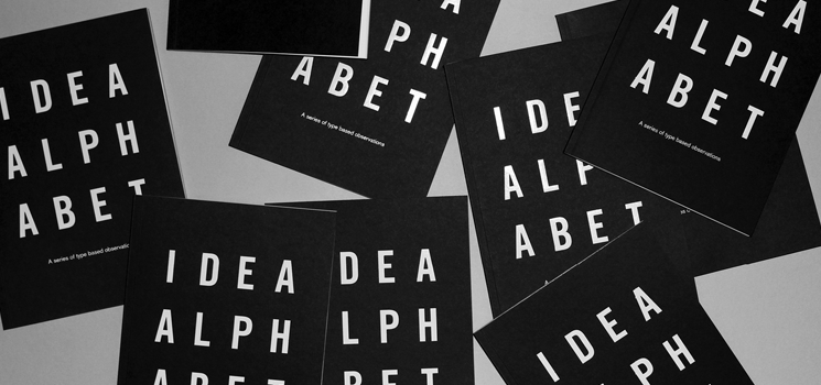
Jordan’s passion for letterforms is evident in many of his projects including the popular Idea Alphabet book, the news of which has been making its way around the blogosphere recently.

Hi Jordan Blyth, firstly, could you tell us a little about yourself?
My name is Jordan Blyth, I’m a graphic designer based in Norfolk (UK), specialising in identity design and branding, with a firm belief in conceptual thinking and the importance of ideas being at the heart of considered design solutions.
I began my working life as a sign maker on leaving high school. Having dealt with designers during this period and having had this experience of being involved in an area of the creative industry I soon became frustrated at the lack of creativity within the particular role and so as a result this lead to me applying for a position on a Graphic Design Degree course at Norwich University of the Arts, for which I was subsequently offered a position and three years later I successfully graduated (2008).
I spent the following few years completing numerous placements, internships, freelance positions, whilst more recently setting up my own studio working with my own clients across the country and beyond.
In my spare time I’m a bit of a design geek so enjoy reading design related books and magazines. I also play semi-professional football, I say semi-professional but don’t get too carried away, it’s a world away from the Premier League!

Your project Idea Alphabet illustrates your passion for typography and letter forms. Could you give us some insight into your inspiration for the project?
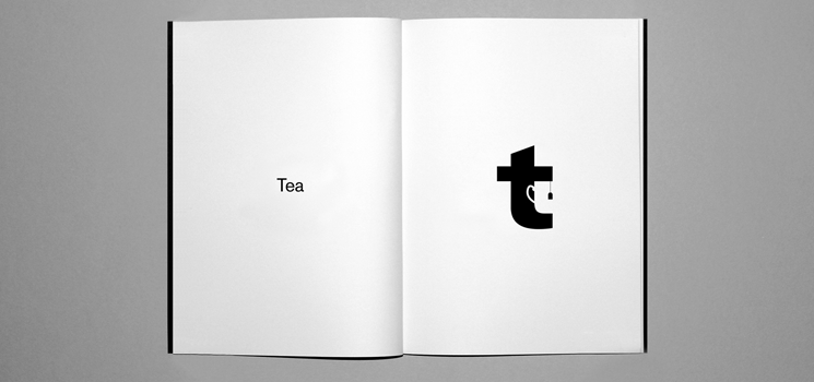
My inspiration for the project stems from my interest in playful and witty thinking. I like the challenge of being able to represent ideas within shapes, type, logo’s etc. A prime example of this would be the iconic FedEx logo and the way it manages to subtly incorporate a reference to the companies nature of business within the typography of the company name. It’s that ‘wow’ moment when you see the arrow (pointing forwards), positioned between the ‘E’ and ‘x’ that I really enjoy people discovering, just as I did myself when it was pointed out to me.
The 20th 366 Award goes to Jordan Blyth for his outstanding creative work.
The project itself pretty much just happened organically over the past few years. I always keep a notebook handy and just tend to jot down an idea as and when it comes to mind, this often taking place whilst killing time in between journeys to placements, interviews, client meetings over the past few years. Then one day I decided that I needed to produce some sort of promotional document to send out to prospective clients and people within the industry, just something that would help me stand out from the crowd a little really and so it occurred to me that as I had all of these ideas scribbled in my sketch book I may as well make some use of them and subsequently adapted them into the Idea Alphabet book.

You printed 26 books. What did you do with them and have you got any plans to seek publication for the book?
The idea behind the having 26 books printed was that obviously it had a nice ring to it given the number of letters in the English alphabet, however the main reason for the low number of copies was that I also wasn’t really sure how they would be received so decided that I would test the water to begin with and see what happened.
The response I’ve received over the past few weeks has been rather surprising, it hadn’t really occurred to me that people might actually want a copy of the book, however since they’ve been featured on various design blogs I’ve had a number of enquiries from places including Singapore, Australia, America and the UK.
With the 26 books I had printed, I distributed these between a few friends, colleagues and admired industry professionals/organisations etc so they soon ran out.
In terms of seeking publication, it’s not something I had considered, it was never a project I was looking at as a potential money maker, I was simply just hoping to produce something that would help me engage with prospective clients and collaborators, however given the positive feedback I will almost certainly be looking at another print run as soon as I can find the time to get round to it!

Throughout our projects you’ve utilised a range printing features such has hot foil and embossing but what are your thoughts on the decline of the print industry?
I think it’s inevitable that print has seen a decline, given the advances in technology making information instantly assessable at the click of a button, however I think there will always be a place for physical documents that you can hold, feel and smell, as one thing a tablet, laptop or mobile cannot do is replicate the tactile nature of a beautifully printed book, magazine or business card. For example, in the past I’ve designed stationery utilising a variety of print techniques including foil, letterpress, screen print and embossing presses, all of which have their own inherent qualities in making an object more interesting to interact with.

Tell us about some of your inspirations.
Most of my inspiration comes directly from the world of design as that’s what I immerse myself in on a daily basis, so I’m constantly checking the latest updates on my favourite design blogs and seeing what other individuals and organisations are producing.
Where do you see yourself in 5 years’ time?
Well, I love design, so in 5 years’ time I hope I’m still doing pretty much what I am today. However I’m always on the lookout for new and exciting opportunities and so would just hope to be working with more like-minded individuals and organisations.
And finally, if you died and were reincarnated as a song, what would that song be?
Wow, that’s a rather tough/strange question, it’s really difficult to pick just one but how about the national anthem?!


