Creative Chair talks to the UK designer behind this year’s hottest design book, Craig Ward.
It has been mentioned that the Creative Chair thus far was somewhat internationally biased. Well, it’s true that we’ve had the privilege of speaking to some of the world’s top creative minds, however, bias has nothing to do with it. Nevertheless, today we have the privilege of interviewing to one of the UK’s top creative designers, with a plethora of A –List clients, not to mention a bestselling typography book, Craig Ward.
Aside from his book Craig Ward has worked for the likes of MTV, WIRED, Talk Talk, Lexus and (RED) to name but a few.
It’s time to find out a bit more about the man behind the magic. Find out more about Craig Ward on his website.
Firstly, could you tell us a little bit about yourself?
Sure, I’m a British typographic designer and art director currently based in New York City and my studio is on the Brooklyn waterfront overlooking Manhattan. I’m the author of the Amazon best-selling book ‘Popular Lies About Graphic Design’, a contributor to several industry journals, former ADC Young Gun, recipient of the Type Directors Club’s Certificate of Typographic Excellence and a TEDx speaker. In addition I’ve been fortunate enough to work with some amazing clients in the publishing, advertising, fashion and music fields.

Which of your projects are you most proud of and why?
I’m proud of all of them to an extent, but I think the ones I think of most fondly are the ones where I’ve had a chance to really break some new ground in my field. Those have usually come about through collaboration with people from different disciplines – photographers, immunologists, artists and biochemists among them.

What prompted your move from sunny England* to New York?
I feel like my life was always pointing at New York to an extent and I completely blame the media. As a kid in the 80’s, virtually every pop culture touchpoint that I was into – or remember now at least – was based in New York. By that I mean Ninja Turtles, Ghostbusters, Police Academy, Big, An American Tail, Short Circuit… it goes on!
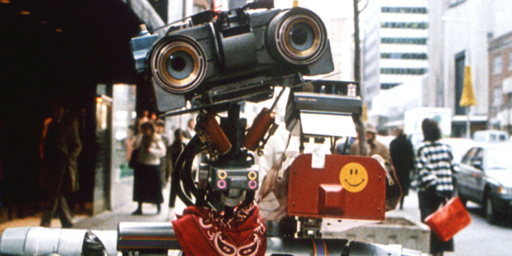
So the seed was sewn early on and, after a university trip to the city in 2002, I made a pact with myself that it was somewhere I wanted to work at some point. In addition, the city has been very good to me; my first paid commission came from The New York Times Magazine in 2007 and I’ve had various commissions since that point. When a job offer at Grey came along in 2009 to be Head of Design I jumped at it. I knew the work wasn’t going to be groundbreaking but it got me here, I made a bunch of friends and it gave me the confidence to go it alone over here.

What/who have been your greatest inspirations for your work thus far?
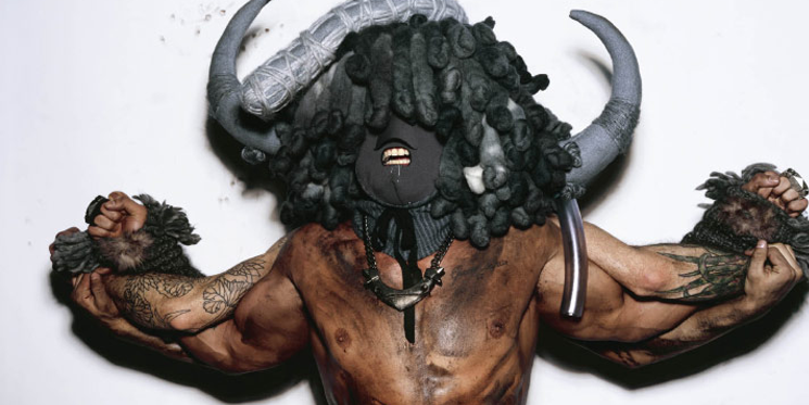
Probably not who you’d think. I mean, of course, I’ve always loved the ‘symbolise and simplify’ maxim of designers like Saul Bass and Alan Fletcher, and I love their playful way with words. And of course, you can’t help but pay homage to designers like Herb Lubalin but, all that being a given, I think I’m more inspired by people like Chris Cunningham and Nick Knight – real field pioneers – and I have a soft spot those late 80’s horror films – like The Thing – where the CGI wasn’t quite there yet but the animatronics and stuff they did for real was about as good as it was going to get… I love how innovative they had to be so that stuff really speaks to me as I love doing things for real where possible.
When I first started designing, I saw typography as more of an obstacle that needed to be worked around than a centrepiece. Did you ever have similar feelings and if so, when did you first realise typography’s potential for spearheading a project?
Yes, without doubt. My first type-centric lessons were dry to say the least. But again, I think once you learn the basic rules of typography and stop seeing them as limiting factors you actually begin to see how they can work in your favour. And when you realise how important type select and treatment is in your work you have to get with it or your work really suffers. I didn’t really get into it until the 3rd year at university; we had a type tutor (Henrik Kubel of A2 Graphics) who really made me want to play with type physically and encouraged us all to get up into the letterpress and printmaking department.
I regret not making more of the time I had there….
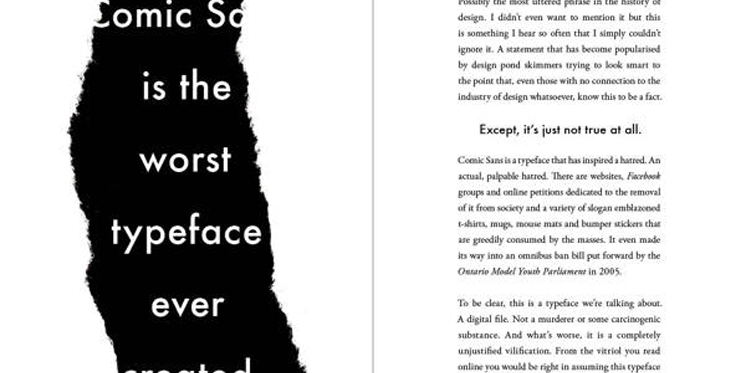
Could you describe the process that led from your idea to write your book ‘Popular Lies* About Graphic Design’ to its publication?
Well, we have to track back about 14 years briefly, when I was about to go to college to study journalism. I did my work experience at the local paper and it was there, on a trip to the printers, that I met my first Graphic Designer. It interested me enough to postpone my university application in favour of a 1 year foundation course in design. So, I’ve always enjoyed writing and, after I left Grey in 2011, thought that it might be nice to plug the gaps between commissioned projects with some writing.
The 19th 366 Award goes to Craig Ward for his outstanding creative work.
At first I conceived it as a series of blog posts but, once I’d arrived at 5000 words it struck me that, maybe it would be nice to combine my two interests and try and get a book out of it. I approached a couple of publishers with the outline and this early draft and Actar were really into it. We resolved to get it finished before the end of 2012 and, honestly, it kind of wrote itself. I thought back to all the bad advice I’d been given working in agencies, all the students who have asked for my opinion over the last 9 years and the words literally fell over themselves to get onto the screen.
It was a lot of fun to put together – even though I only had two and a half weeks to lay out all 160 pages – and I hope that shows. I never wanted it to be some, nose pinching, authoritative ‘How to design’ tome, rather I thought it might be nice to have as something to dip in and out of. My brain on paper kind of thing. And the response has been great so far!
What are your five favourite typefaces?
Bah… my least favourite question! My favourite typeface is whatever I’m using at the time, I really don’t have a go-to and I try and treat every project as a completely new thing. If I already have a preconceived notion of what typeface I’m going to use I feel like I’m projecting self too much, so each project gets the same amount of exploratory time as the next.
What is your least favourite typeface?
There are a million. Any of those faux-letterpress fonts you see all the time, all the fake handwriting fonts, graffiti style fonts and distressed fonts… Anything you can do yourself you should. How much work is it to print out a word, rub it around on a wall and then scan it back in?! Or pass a sheet of paper round the office asking people to write a headline out for you? So lazy.

And finally, if you died and were reincarnated as a song, what would that song be?
Paint it Black by the Rolling Stones. Hah, I wish I were that cool! It would probably be something far more lame.


